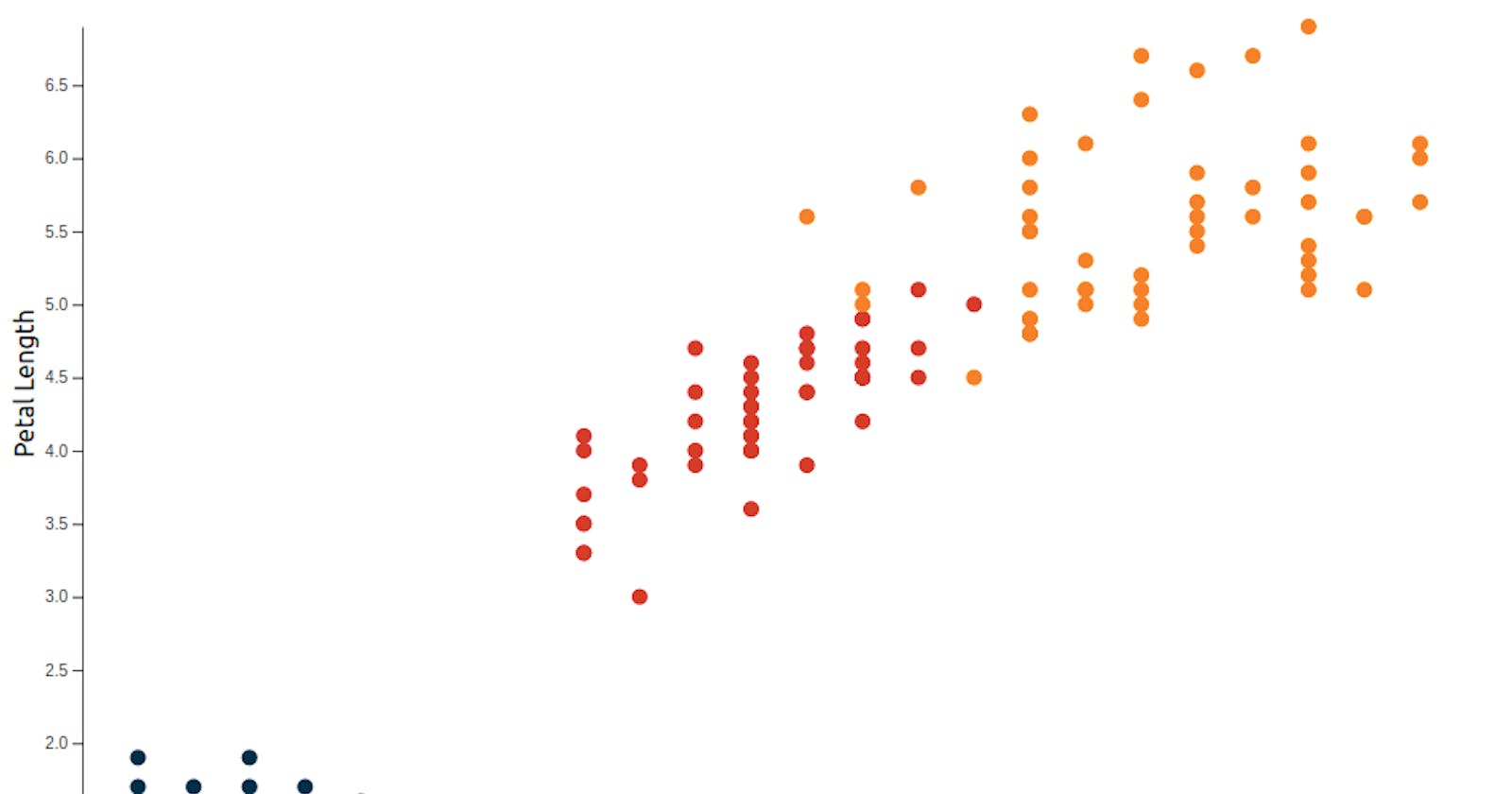
This blog is second in a series of (unofficial) course notes for the Data Visualization with React and D3 series by Curran Kelleher. Read the introductory blog post here.
The next chart in the series is a scatter plot based on the Iris Flowers Dataset . I figured we could reuse a lot of the code from earlier examples than rewiriting everything from scratch. A properly cleaned version of the dataset by Curran is available here .The dataset has four numerical columns namely sepal_length,sepal_width,petal_length,petal_width which we need to convert to numbers. Let's change the row and onMount functions to reflect this:
const  row  =  function  (data)  {
    data.sepal_length  =  +data.sepal_length;
    data.sepal_width  =  +data.sepal_width;
    data.petal_length  =  +data.petal_length;
    data.petal_width  =  +data.petal_width;

    return data;
};

onMount(async  ()  => {

    dataset  =  await  csv(
"https://gist.githubusercontent.com/curran/9e04ccfebeb84bcdc76c/raw/3d0667367fce04e8ca204117c290c42cece7fde0/iris.csv",
    row
    ).then((data)  => {
        return  data;
    });
});
in case you are wondering where this code came from, look up this gist
The scaleBand logic we used before doesn't make much sense in a scatter plot so we need to change that to scaleLinear. I am going to plot petal_width on X-axis and petal_length on Y-axis and so let's change the domain of xScale and yScale respectively. Again doesn't matter too much, so feel free to change the X and Y axes to your liking.
$: xScale  =  scaleLinear()
    .domain(extent(dataset, (d)  =>  d.petal_width))
    .range([0, width]);

$: yScale  =  scaleLinear()
    .domain(extent(dataset, (d)  =>  d.petal_length))
    .range([0, height]);
To make the dots for the scatter plot we can make use of the <circle> SVG tag. in the plotting logic let's replace the <rect> tag by circle and specify its attributes appropriately.
<circle
    cx={xScale(data.petal_width)}
    cy={yScale(data.petal_length)}
    r="5"
/>
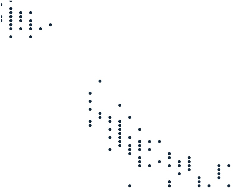 Something you probably noticed here is that some dots appear to be cutoff from the SVG. The solution I can think of is to shift all the circles to the left. So I am going to wrap all the circles in a
 <g> apply the transform directive on it. Lets use the margins that we initialized way back before to translate it across:
<g  transform={`translate(${margin.left},${margin.right})`}>
    {#each  dataset  as data, i}
        <circle
        cx={xScale(data.petal_width)}
        cy={yScale(data.petal_length)}
        r="5"
        />
    {/each}
</g>
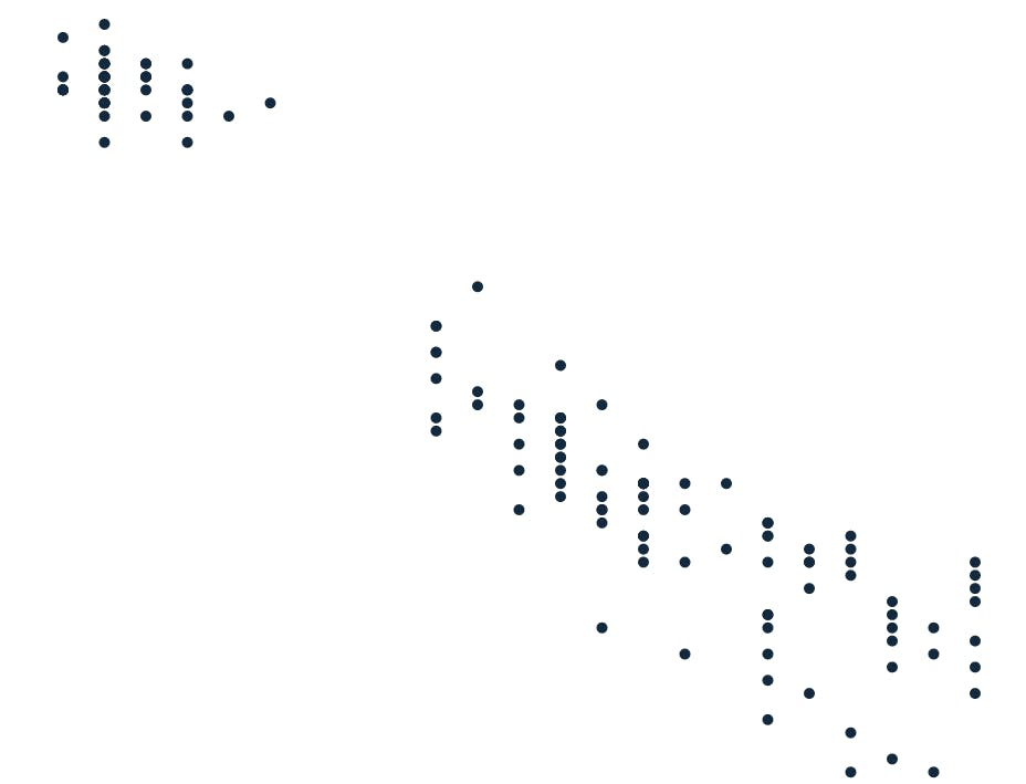 I am also going to reconfigure the scales so that we have more space to work with at the bottom of the page and left.
const  innerHeight  =  height  -  margin.top  -  margin.bottom,
innerWidth  =  width  -  margin.left  -  margin.right;

$: xScale  =  scaleLinear()
    .domain(extent(dataset, (d)  =>  d.petal_width))
    .range([0, innerWidth]);

$: yScale  =  scaleLinear()
    .domain(extent(dataset, (d)  =>  d.petal_length))
    .range([0, innerHeight]);
The Iris flowers in this dataset are of three different species. I think it makes sense to represent them with different colors. I am going to map an array of colors to the species using the scaleOrdinal function in D3.
const  colorSet  =  new  Set(dataset.map((d)  =>  d.class));

$: colorScale  =  scaleOrdinal()
    .domain(colorSet)
    .range(["#003049", "#d62828", "#f77f00"]);
And then change the <circle> element as follows:
<circle
    cx={xScale(data.petal_width)}
    cy={yScale(data.petal_length)}
    r="5"
    style={`fill:${colorScale(data.class)}`}
/>
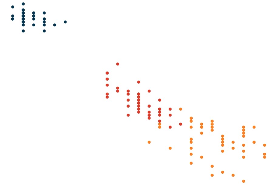 I think I'll make this a (slightly) more fully fleshed out chart and add labels and axes. First lets add x and y-axis labels. Labels are ofcourse just
 <text> elements.
We add the Y-axis label as follows:
<text  transform={`translate(${-25},${innerHeight  /  2}) rotate(-90)`}
>Petal Length</text>
That cryptic transform essentially just shifts to the left of all the circles and then rotate it. The Y-axis label is added as follows:
<text x={innerWidth / 2 } y={innerHeight + 30}>Petal Width</text>
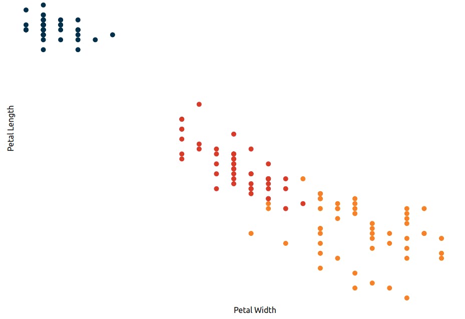 Let's add an X-axis and Y-axis. We could write our own Axis component but I saw a nice reusable axis component that I quite liked here. I am going to make a few changes there and use it.
<script>

    import { select, selectAll } from  "d3-selection";
    import { axisBottom, axisLeft } from  "d3-axis";


    export let  innerHeight;
    export let  margin;
    export let  position;
    export let  scale;


    let  transform;
    let  g;

    $: {

        select(g).selectAll("*").remove();

        let  axis;
        switch (position) {
            case  "bottom":
                axis  =  axisBottom(scale).tickSizeOuter(0);
                transform  =  `translate(0, ${innerHeight})`;
                break;

            case  "left":

                axis  =  axisLeft(scale).tickSizeOuter(0);
                transform  =  `translate(${margin}, 0)`;
    }
    select(g).call(axis);
}
</script>

<g  class="axis"  bind:this={g}  {transform} />
Finally lets import the axis component and add it in the <g> element like so:
<Axis  {innerHeight}  {margin}  scale={xScale}  position="bottom" />
<Axis  {innerHeight}  {margin}  scale={yScale}  position="left" />
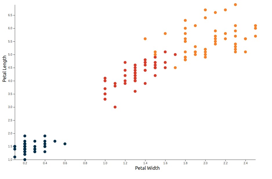 Yeah the Y-axis is inverted 😬. Turns out I have doing this a bit wrong. For the record, I did wonder how such thin petals were so long. But then again what do I know about Iris flowers. Fixing this is easy enough. Let's change
 yScale as follows:
$: yScale  =  scaleLinear()
    .domain(extent(dataset, (d)  =>  d.petal_length))
    .range([innerHeight, 0]);
If you want a simple scatter plot then this is probably all you need. I actually went on to add some more (completely unecessary) styling to it. I wanted to see if for each species of the flower we could have different shaped-petals. Not Iris petals shapes of course but petals nonetheless.
So I gathered some petal shapes from a FrontendMasters workshop by Shirley Wu here, modified them ever so slightly and saved as paths.js
export const  petalPaths  =  [
    'M0 0 C5 5 5 10 0 10 C-5 10 -5 5 0 0',
    'M-3.5 0 C-2.5 2.5 2.5 2.5 3.5 0 C5 2.5 2.5 7.5 0 10 C-2.5 7.5 -5.0 2.5 -3.5 0',
    'M0 0 C5 2.5 5 7.5 0 10 C-5 7.5 -5 2.5 0 0'
]
Let's import the petalpaths and map them to species using D3 scaleOrdinal.
import { petalPaths } from  "./paths";
$: shapeScale  =  scaleOrdinal().domain(classSet).range(petalPaths);
Finally instead of plotting circles, we plot a <path> element and set the d attribute to shapeScale.
<path
    d={shapeScale(data.class)}
    fill={`${colorScale(data.class)}`}
/>
We wrap it in a <g> element and translate it to their respective position so that they dont overlap each other.
<g

    transform={`translate(${xScale(data.petal_width)},${
    yScale(data.petal_length)  -  5
    })`}
    >
    <path
    d={shapeScale(data.class)}
    fill={`${colorScale(data.class)}`}
    />
</g>
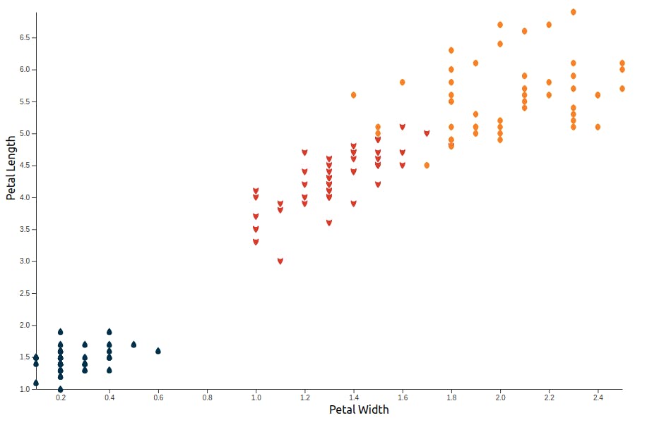 I love this plot!
One thing to notice here however is that the plot does loose some accuracy on adding the shapes. So if that's an important concern then best stay away from it. Anyway, I think I'll end here.
Here's the full code -
So that's it for today. Have a nice day
