This blog is part of (unofficial) course notes for the Data Visualization with React and D3 series by Curran Kelleher. Read the introductory blog post here .
The first chart Curran explores is a simple horizontal bar chart. The data used for the chart is United Nations World Population Prospects data available here on their website. I am going to be using a (badly cleaned 😬) slice of the data . In and itself, the data doesn't matter too much here. So long as it has atleast one value which we can plot as bars, any data should be useful without too much change.
To kick of the project, let first make a simple Svelte app. Degit package is a simple way to start building apps with Svelte. Feel free to replace bar-chart with any project name you want.
npx degit sveltejs/template bar-chart
cd bar-chart
npm install
This will download a starter Svelte project, build out a folder structure and install the dependencies for Svelte. To use d3, we need to add d3 to our project:
npm install d3
To run the Svelte app use
npm run dev
I am going to make a folder called data and save the csv file there. To load data I are going to use the csv utility from d3.
<script>
  import { csv } from "d3";
  import { onMount } from "svelte";

  let dataset = [];
  onMount(async () => {
    dataset = await csv("data/population_data.csv").then((data) => {
      return data.slice(0, 10);
    });
  });
</script>
Okay there's more going on here than I promised. First off, I am going to take only a slice of 10 rows from the dataset, rather than taking everything. The onMount function is a lifecycle function from Svelte which runs when the component is first loaded. Now I don't think this is actually required here. Something like
csv("data/population_data.csv", row).then((data) => {
    dataset = data.slice(0, 10);
  });
works just fine. onMount just looked like a convenient place to do the data loading work.
Now I am only going to plot the population for only the year 2020. So I am going to select that as a separate column. d3.csv only provides the output as strings. We need to convert those into numbers. Fortunately the csv method has support for an accessor function which can be used to do the necessary preprocessing.
const row = function (data) {
    data["Population"] = +data["2020"] * 1000;  // + here is the unary conversion operator
    return data;
  };
onMount(async () => {
    dataset = await csv("data/population_data.csv", row).then((data) => {
      return data.slice(0, 10);
    });
  });
The population figures are in millions, so the multiply by thousand. In D3 we generally use SVG to render our graphics. Let's define a height and a width for our SVG and provide it with a few margins as well.
const margin = { top: 20, bottom: 20, left: 20, right: 20 };
const width = 840,
height = 60

;
And finally let's plot the svg.
<main>
  <svg {width} {height}></svg>
</main>
In case you are wondering why we are not writing
width={width}sort of syntax, then that's Svelte's shorthand for attributes
At the moment of course, there's nothing on the browser to see. Let's start changing that. Bar charts are essentially a bunch of rectangles arranged nicely. SVG has a rect block which can be used for this purpose. We need to create one reactangle for each element in our array.
<svg {width} {height}>
    {#each dataset as data, i}
      <rect width={width} height={10} />
    {/each}
  </svg>
This is Svelte's {#each} block which is essentially a forEach which can render html. For now we'll ignore the height and width of the rect. This is what we get at the moment

It might look like only one bar but the Element inspector will show that there are 10 of them overlapping each other. To shift the bars down and to resize the bars we need to use the concept of scales. More specifically we need the scaleBand and scaleLinear functions from d3.
const yScale = scaleBand()
    .domain(dataset.map((d) => d["Location"]))
    .range([0, height]);

const xScale = scaleLinear()
    .domain([0, max(dataset, (d) => d.Population)])
    .range([0, width]);
Let's now change the rect tag to reflect this updated scales.
<rect
        x={0}
        y={yScale(data.Location)}
        width={xScale(data.Population)}
        height={yScale.bandwidth()}
/>
There we go. The browser reloads and .... it does not work!!! You refresh again hoping that maybe Svelte is a bit slow to update but the browser remains the same empty blank sheet it was 10 mins ago. In despair you turn to the inspector and it says nope width cannot be "NaN".
This is a pretty surprising error as the code you wrote seems pretty reasonable. The thing I forgot here is that csv is being processed asynchronously. So when xScale and yScale are being processed they are working on empty arrays. The dataset array changes on the way and we need our xScale and yScale to react to that change. This seemed like a perfect case for using Svelte state . Let's change the const to $:.
$: yScale = scaleBand()
    .domain(dataset.map((d) => d["Location"]))
    .range([0, height]);

$: xScale = scaleLinear()
   .domain([0, max(dataset, (d) => d.Population)])
   .range([0, width]);
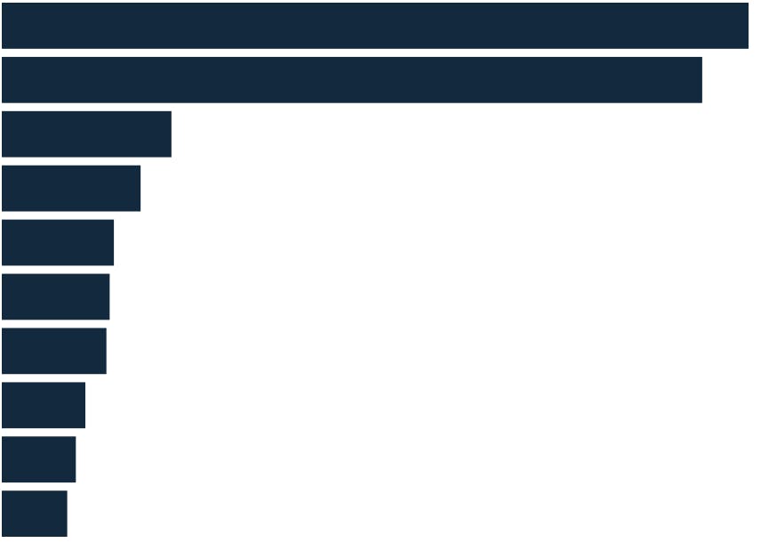
And that works. There we have it. A perfectly horrible looking bar chart.

Now while, I love the stark simplicity and gravity if this bar chart, I am being told that this is simply not enough for this to be a multi-million dollar NFT. Let's clean this up a bit, add some spacing between the bars and some color to the chart
$: yScale = scaleBand()
    .domain(dataset.map((d) => d["Location"]))
    .range([0, height])
    .paddingInner(0.15);
<style>
  rect {
    fill: #13293d;
  }
</style>

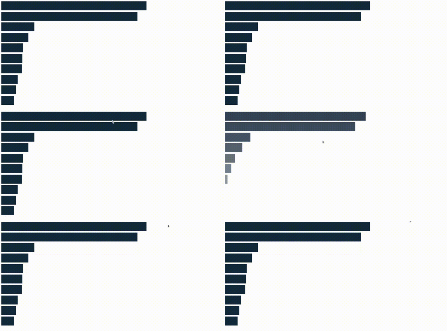
That is a bit better. Let's add some transitions because its so easy to do so in Svelte. grab the fly transition from Svelte.
import { fly } from "svelte/transition";
And modify the rect block as follows.
{#each dataset as data, i}
      <rect
        x={0}
        y={yScale(data.Location)}
        width={xScale(data.Population)}
        height={yScale.bandwidth()}
        in:fly={{ x: -200, duration: 1000, delay: i * 50 }}
      />
{/each}

Here is the whole code for the graph.
That's all for today. Hope you had fun reading this!!
Thanks to Curran Kelleher for creating this amazing course
P.S. If you want a more complete example with title and axes and styling, look here